Today you’re going to learn how to build a mega menu for your WordPress website by using Royal Elementor Add-ons alongside with Elementor.
Check out our step-by-step video tutorial down below:
Step 1. Getting Started with Mega Menus: Your First Steps to Better Navigation
First things first:
To follow along with this go-to guidebook for adding Mega Menu to your Elementor website, you will need to install Royal Elementor Addons (500,000+ active installations).
Fortunately, this is as easy as it sounds.
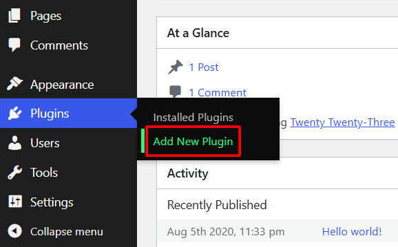
Click Add New Plugin in your dashboard’s Plugins section.
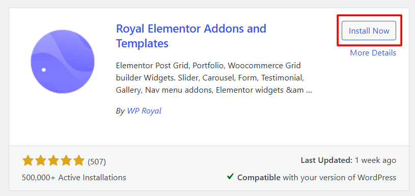
Search for Royal Elementor Addons, click Install Now and activate the plugin.
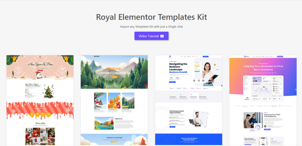
Also, in this step-by-step guide we’ll be using free Royal Elementor kit (which you can add from your dashboards Appearance section), but you can use any other Elementor compatible theme.
Now:
Click on Royal Addons theme on your dashboard and go to Template Kit section. Import any templates kit with just a single click from the library.
And on to the Mega Menu.
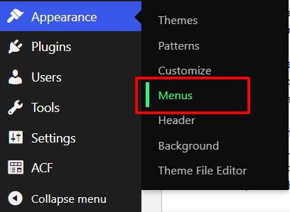
To begin with, go to the dashboard again and in Appearance section click on Menus.
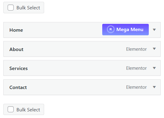
This is a standard WordPress menu.
As you can see, when hovering over the menu items it shows a button that says Mega menu.
But keep in mind that we can only build the mega menu for the parent items and not for the sub items.
Click on that Mega Menu button.
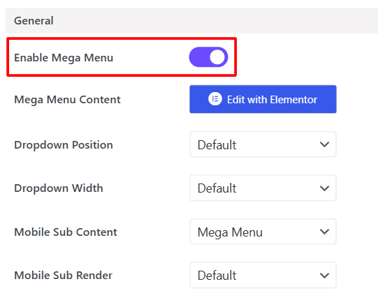
From this window you can manage most of the mega menu settings.
First of all, enable Mega Menu and then click on edit with Elementor.
Here’s what you need to do next…
Step 2. Customize with Ease: How to Edit Mega Menu Content
After you click edit with Elementor, it will display a window, which is basically a standard Elementor editor, where you can edit things just like on any other Elementor page or section.
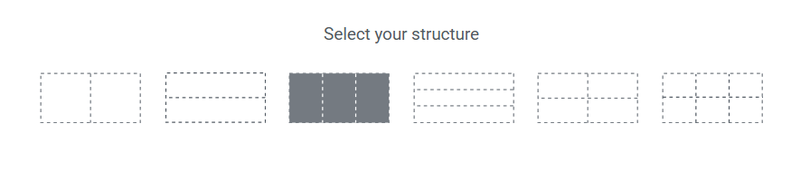
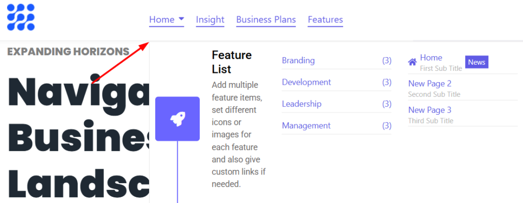
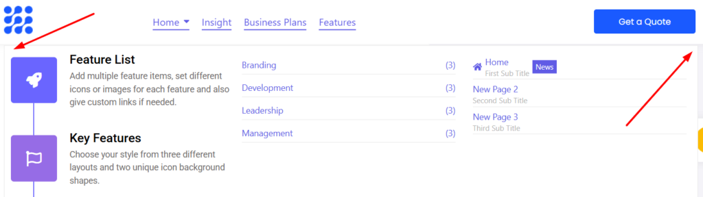
Click on + icon in the middle of the page to add a new container.
Then choose a grid layout with 3-column structure.
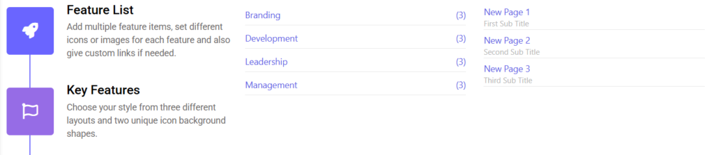
Click on the first container, go to the widgets section and choose, for example, a Feature List widget and drag and drop it in the first container.
Do the same for the second and third containers, choosing, for example, Taxonomy List and Page List.
Step 3. Simplify Navigation: How to Use the Page List Widget Effectively
The Page List widget was created specifically for Mega Menu. By using this widget you can display in your Elementor Mega Menu any page you’d like to.
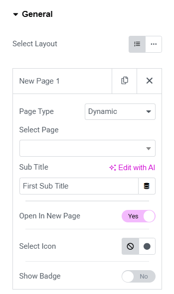
On the left side, in general settings for the widget, you have a page list where you can add any number of pages.
You can also choose the page type.
It will be either custom or dynamic.
If you set it to Dynamic, it will show you the related pages.
You can also choose whether to open it in a new window or not.
Now switch on Badge toggle for additional small text next to a menu item.
Choose an icon for your page.
But that’s not all…
Click publish, close the editor window and make sure that Mega Menu in settings window is enabled.
Save the changes. Go to your website and refresh it. It’s still not going to display your Mega Menu.
You’re probably wondering, why is that?
Step 4. Adding Elementor Mega Menu Widget for Enhanced Functionality
The reason it’s not displaying the Mega Menu yet is that right now in your header you are still using a standard menu widget, but you need to replace it with the Mega Menu one.
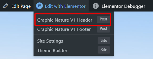
Hover over edit with Elementor on your website and click on V1 Header.
Now if you click on edit in the top right corner of the header, you’ll see that it’s still the standard Nav Menu widget.
Right-click and delete it – you’re going to replace it with a new Mega Menu widget.
Search for it in the widgets section and drag and drop it into your header.
Click publish.
Now if you refresh your website, you can see that it displays the Elementor Mega Menu, which you’ve created a moment ago.
Step 5. Master the Backend: A Complete Overview of Mega Menu Settings
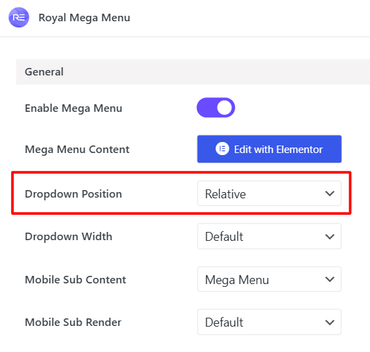
Go back to the Mega Menu settings window.
The Dropdown Position feature is set to default, which means that the dropdown subcontent of the mega menu is positioned where the Mega Menu widget starts itself.
Now, if you set the Dropdown Position to Relative, click on Save and refresh your website, you can see that the mega menu subcontent starts from the parent element.
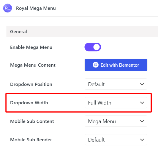
Let’s continue with the Dropdown Width feature.
In case of the default width, the subcontent of the Mega Menu will take the entire width of the widget itself.
Choose the full width, refresh the website again and now you can see that the Mega Menu takes the width of the entire screen.
Another option is to set the width to custom pixels.
Let’s continue by overviewing some of the additional features of the Elementor Mega Menu.
Keep reading…
Additional Features: Vertical Layout, Mobile Nav, Offcanvas Menu and Hover Effects
We’ll start with Layout settings.
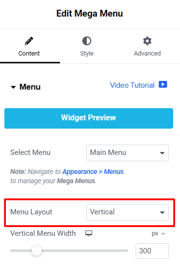
Go to the header editor’s section.
Right now the feature is set to horizontal.
Change it to vertical and now your menu will have a vertical layout.
It may not look pretty for some website templates, but you can create a very appealing mega menus by using vertical layout feature.
Set the layout to horizontal again.
In Mobile Menu section you have this feature called Show on.
It basically enables you to choose when do you want the mobile menu to show up.
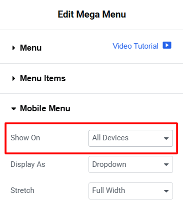
When using Pro version of Royal Elementor Addons you can set it to All devices.
And it will always display the mobile menu with the hamburger icon.
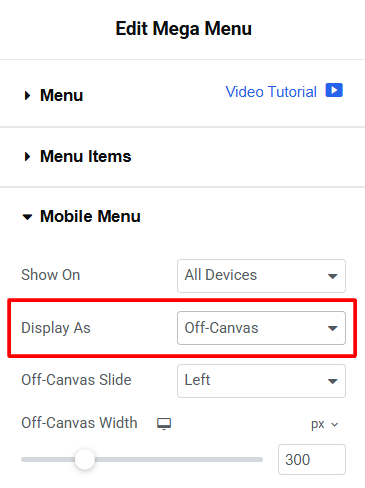
There’s also an option that lets you choose how you want the mega menu to be displayed.
If you choose the off-canvas option, for example, the menu will appear off-canvas with a little slide animation (you can choose the slide direction as well).
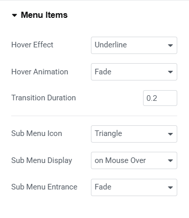
The final additional feature that we’re going to present here is hover effects.
It could be found under Menu Items settings.
By default hover effect is set to Underline, but you have a few other options to choose from like Overline or Double Line and many others.
You can also choose a different hover animation like Slide, for example, and set the transition duration as well as change Sub Menu Icon.
Now let’s move on to the Pro features.
Pro Features: Explore the Power of Advanced Elementor Mega Menu Tools
We begin with Dropdown Width feature, because in Pro Version we have another option there, which is a Fit to Section.
Choose it, click on Save and go back to your website.
Now your Mega Menu width matches its parent section width.
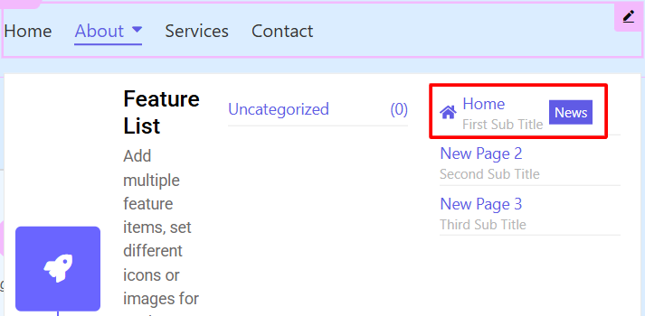
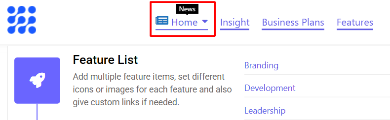
Another great Pro feature is the option to add an icon and a badge for parent menu item.
Go back to the Mega Menu settings window.
Select an icon (news, for example).
You can also choose the color of the icon.
Set the icon size in pixels (18, for example) and enter badge tags for your parent menu item.
This gets even better…
You can enable animation, click on Save and go to your website.
Refresh it and now the icon as well as news page has a little animation effect.
Sometimes there might be a lot of content in your Mega Menu, which could slow down the website load speed.
For such cases we have the Mobile Sub Render feature, where you can choose Load with Ajax option.
Now go to your header editor and refresh it.
Then if you choose tablet or mobile mode and click on hamburger icon, you’ll see that the Mega Menu will only load if you click on its parent menu item.
This can improve your website’s performance.
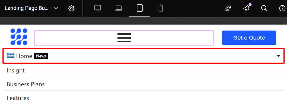
There might be a case when you want your Mega Menu to be displayed only on a desktop version of your website.
To do this, go to the menu settings in Appearance section of your dashboard.
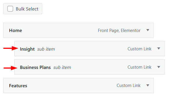
Under Home page, for example, put some child items as a sub menu (just drag them slightly to the right) and save the changes.
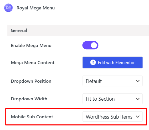
Now go to Mega Menu settings, set the feature Mobile Sub Content to WordPress Sub Items and click on Save.
Switch back to the header editor and refresh it.
You can see that on a desktop version it still shows the normal Mega Menu.
But if you go to the responsive mode and click on hamburger icon, it will only show the WordPress native Sub menu that we’ve just created.
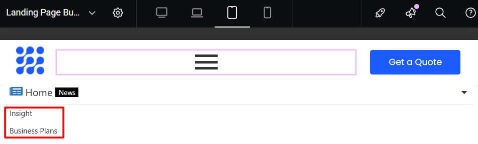
This feature could be a very handy when customizing tablet or mobile versions of your website.
That’s it for this guide.
If you have any questions please comment below or go to our support forum.
You can download the Plugin or upgrade to the Pro version on the Home page of our website.
See you in the next one.